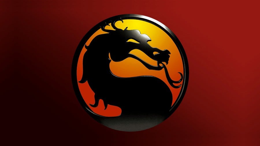
Mortal Kombat might have evolved as a series since its inception in the early '90s, but one thing has remained constant – that amazing dragon logo.
Co-creator John Tobias has been speaking about how he came up with the iconic image on his Twitter account (thanks, IGN), and it's a fascinating thread that's well worth a read.
The thread was inspired by the discovery of the drawing that was digitised by John Vogel – another Mortal Kombat artist – and featured in the game itself.
Tobias explains:
The inspiration to use a dragon as the fictional tournament’s symbol came from “Dragon Attack,” which was in contention as our game’s title before [Ed Boon] and I changed it to “Mortal Kombat.”
The name “Dragon Attack” came from [Ed Boon]'s love for the band Queen and their song of the same title. I used the colours described in the lyrics of that song on our eventual coin-op cabinet design.
The inspiration for the dragon icon’s design started when John Vogel saw a golden dragon statue on the desk of Midway’s general manager, Ken Fedesna.
John borrowed it to digitize for use in our game’s backgrounds. I saw the dragon statue and thought of using an Asian-inspired dragon design as part of our coin-op cabinet’s side panel art.
Interestingly, Tobias explains that we very nearly didn't have this famous logo at all:
Side Note: I almost tossed the dragon icon sketch aside when I was at home working on it at my drafting table and my sister mistook the dragon for a seahorse.
If you'd like to read more about Mortal Kombat, be sure to check out our feature on the home conversions of the game.
[source twitter.com, via ign.com]


Comments 2
Wait, that isn’t a sea horse? Wow, I’ve been waiting 30 years to fight a sea horse and it’s for nothing.
Thank goodness the icon remained. The Asian kung fu movie influence on the original MK made it stand out further from the crowd.
Show Comments
Leave A Comment
Hold on there, you need to login to post a comment...