Capcom has just revealed the final box art for Street Fighter 6, and it hasn't gone down all too well.
"A bit lazy imo. They could use much better artwork for this," comments Pedro Soares, a man who has worked tirelessly to promote cool box artwork on social media recently. "Luke channelling his Popeye energy," says another Twitter user. If you look around online, you'll find even harsher critiques of the cover.
Now, I'm not a graphic designer by trade, but I think even I could do a better job than what Capcom has cooked up for Street Fighter 6. It's a bland and rather insipid piece of artwork that does little to communicate the game's appeal and energy.

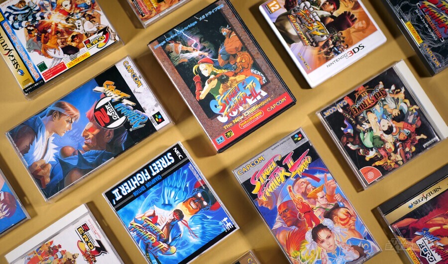
What makes this cover artwork even more disappointing is that Street Fighter, as a series, has had a pretty solid run when it comes to packaging. Capcom, of course, created some of the most iconic video game art of the '80s, '90s and 2000s, so that should come as no real shock.
Even back in the early '90s, Street Fighter fans were being blessed with some pretty radical artwork; admittedly, the Japanese versions were always superior to the western ones, but on the whole, the eye-catching logo and amazing art ensured that Street Fighter always stood out from the crowd (the less said about the western cover for Super Street Fighter II on the SNES and Mega Drive / Genesis, the better, though).
However, Capcom appears to have "smoothed off the edges" when it comes to Street Fighter 6. There's little on this cover to catch the eye; even the logo is plain. Before this becomes too negative, I will say that everything I've seen of Street Fighter 6 in action has been amazing – the game itself is looking fantastic, even if its cover isn't.
There's really no excuse for a series that has this much energy and vibrancy to be saddled with such a dismal cover if you ask me – but what do you think? Vote in the poll below and don't forget to post a comment, too.


