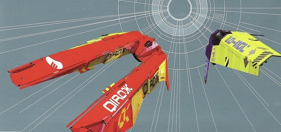
While WipEout got a lot of things right when it first launched in 1995 – amazing visuals, a great soundtrack and tight gameplay – a big part of the game's appeal was the product design, crafted by The Designers Republic.
The Designers Republic had previously found fame creating album covers for artists such as Pop Will Eat Itself, and it took a similar approach with the futuristic PlayStation racer. The iconography fits the game's setting perfectly, and it's hard to imagine WipEout without this related imagery.
One eagle-eyed fan has spotted something really cool about WipEout's iconic logo, and it's something that even we failed to spot after all these years:
Sadly, that particular logo would only be used in the early games, but even so, it's a cool little secret – and now we've seen it, we can't un-see it.
[source twitter.com]


Comments 1
also, every ship on the game has a length of exactly wipE feet and out inches.
Show Comments
Leave A Comment
Hold on there, you need to login to post a comment...