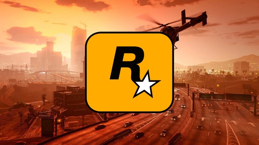
The Rockstar logo is one of the most recognizable in all of gaming, being associated with moneymaking behemoths like Grand Theft Auto V and Red Dead Redemption 2. But have you ever stopped and wondered who originally designed this iconic logo to begin with? Or how the Rockstar brand was initially created? Well, that's what we recently tried to find out. Over the last couple of months, Time Extension reached out to various former employees to ask about the identity of the logo's designer, but this proved harder than we initially thought, as no two sources seemed to agree on who made it.
Some suggested that the New York graphic designer Eric Haze might be responsible, but Haze never returned our emails and we couldn't find anything else to confirm the connection. Other sources, meanwhile, pointed us in the direction of David Kushner's Jacked: The Outlaw Story of Grand Theft Auto, where the author made the claim that the former Rockstar artist Jeremy Blake was responsible. Blake tragically passed away in 2007, however, and our efforts to contact Kushner were again unsuccessful.
We continued asking around with little luck when, just as we were about to give up, out of the blue, the former Rockstar designer Karen Scott replied to our message. Scott was able to confirm to us that yes, Blake was the creator of the famous logo, but that she, too, was responsible. And better yet, she would be willing to talk to us about the process.
Scott hasn’t been interviewed about Rockstar before, at least to our knowledge, but over the course of an hour-long video call, she regaled us with the amazing story of her time at the publisher and how the classic logo took shape.
As Scott tells us, she originally joined what would become Rockstar in early 1998. Prior to that, she had worked with Blake at a digital consultancy company called Nicholson in New York.

She tells Time Extension, "This is a long [time ago], I mean, this is over twenty-five years ago honestly… We were at Nicholson New York, which is actually in Puck Building in New York City, and I met him there because we sat next to each other and he was working with Theresa Duncan at the time [...] I think we were like twenty-five years old. Very young. [One of our contracts was for] the Metropolitan Museum of Art and at the time it went so over budget that we lost a lot of clients and we had a round of layoffs."
According to Scott, it was Blake that introduced her to the founders of Rockstar and got her the job at the new start-up inside Take-Two. As she recalls, the Rockstar co-founder Sam Houser had met Blake at one of the artist's exhibitions and they had immediately hit it off, thanks to their shared love of Stanley Kubrick films and their similar sense of humour. Houser invited Blake to work for him at this new start-up, and the artist later extended this invitation to his former colleague, who immediately accepted the offer.
"No one knew who we were," says Scott. "We were so low-budget, which is funny to think about now because it’s kind of blown up quite a bit. When we got there, it was like ‘Oh my god’, we were working in literally the most closet-sized office you can imagine. I remember at one point, there wasn’t even a desk. There was like a cardboard box and I had to work on top of it. There were only seven of us maybe. Jamie [King] was there and Gary Foreman and Sam and Dan [Houser] and Terry [Donovan]."
When Scott arrived at the start-up, it had still yet to be named, but eventually, the Rockstar title emerged. The next logical move was to create a flashy logo. And so, Blake and Scott were put to work on a design. As Scott recalls, the chief concern at the time was it had to be something that would look good on a sticker, as Rockstar's marketing plan was to plaster them about public areas on telephone poles and walls to raise awareness.
"That was the first thought: okay, it has to become a sticker," she remembers. "It has to be a sticker and it has to have the glue you can’t unpeel at all. Even if you tried. The kind that when you’re a kid in the seventies once you put it on your bedframe, it never comes off. So, the design of this is meant to actually be on things that once you stick it on there, you scrape and you scrape, but you cannot get it off. And so the form factor of the actual logo factored into that. It has that rounded radius around the edge. Then the R is Helvetica Neue, and the gold or yellowish gold is actually something that kind of nods to the seventies almost like early Kodak logos and it has that same kind of vibe as early rock music."
She continues, "When I look at the logo, it is very much Jeremy to me. In terms of the execution and the medium, that would have more been me, in terms of ‘Let’s make it work in all these different cases: if it’s small, if it’s big’. But in terms of the simplicity and the design, I can’t say it’s my aesthetic. It definitely feels very much like Jeremy when I look at it. It’s hard to describe. Working with him, he was great. I don’t know how many people have worked with him creatively, but for me, he’d take me all over the place in terms of like he had someone who was in Brooklyn who was helping with a motion animation for some of his installations. And he would just say funny things to me."
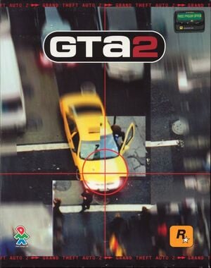
At the time, Rockstar as a company wasn't like the other more corporate jobs that Scott was familiar with. There were no rails, no rules, and as a result, things often got pretty crazy. Nevertheless, there was a shared sense of "us against the world" that made working at the company appealing to the young artist in the beginning, even as things spiralled out of control.
"We’d go to restaurants as a group, and we’d get kicked out of every single restaurant we’d go to," says Scott. "It was bad, and I had to convince them, ‘You know, in the United States, they have guns here, you can’t be trying to randomly start something with someone. You don’t know what you’re going to deal with.’ We also made class rings. It became almost like a cult for us. We were small enough to take risks."
Eventually, though, it all proved too chaotic, and after Scott got pregnant, she knew she couldn't raise her child and be a part of the Rockstar lifestyle.
"It got crazy," says Scott. "It was getting crazy there, and then when Jeremy left, I left with him. I decided to go with him. Because it was getting a little wild and I think for us… It’s not an environment that I felt that I could stay in at some point. And then when Rockstar really started getting big, that’s when there was some weird stuff happening all around."
Scott left Rockstar in 2000, along with Blake. Scott later went to work for the Seattle-based Palazzo Intercreative, while Blake continued creating and exhibiting his artwork eventually contributing the album cover for Beck's 2002 album Sea Change and the abstract painted interludes for Paul Thomas Anderson's 2002 romantic dramedy Punch Drunk Love. He later returned to freelance for Rockstar before his passing. Today, Scott looks back at her time at the company with a mixture of fondness and disbelief. In particular, she remembers Blake fondly, praising the work of her former colleague.
"If you look at Jeremy’s work now, it’s timeless. It’s so beautiful, and at the time, I didn’t appreciate it as much as I appreciate it now, right? Because I was like, ‘Why is the table shaking?’ because we had such a cramped space. [...] Jeremy was really special."

